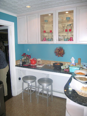
Rose Red's Harmonious Kitchen

I've been known to say that blue and orange are two colors that should never be seen together, 
How do they make two colors so much at odds with one another work without becoming jarring? (I know they're "complimentary colors" but I think they normally look horrid together!)
I think they've made peace between this antagonistic pair since the main colors in this room are neutrals. Large swaths of white on the ceiling and cabinets block the colors off from one another. Black and silver-steel also play their part. Blue's main job is to wash the walls in an unusal hue between teal and baby-blue, while warm orange-red accents such as pottery pieces and hot peppers liven the space and keep it from becoming too cold.
 And somehow these color magicians manage to make this harmonize with their red-and-black dining room. As this view-between rooms shows, there's no emnity between the two spaces. Perhaps it's something that only Rose Red herself could pull off.


Comments